Plugin / Easy Responsive Shortcodes

wpCMSdev

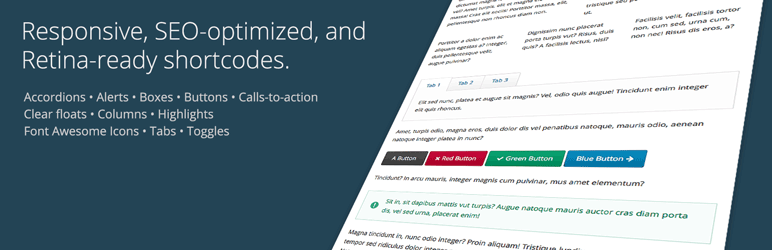
Frequently Asked Questions (FAQ)

Install like any other plugin: Go to Plugins > Add New, search for “Easy Responsive Shortcodes”, and install. Or: Download the plugin’s ZIP file, Go to Plugins > Add New > Upload, and upload the plugin. Or: Download the plugin’s ZIP file, unzip it, and upload it using FTP to /wp-content/pugins/. See the FAQ for usage instructions.
A: You can use the following colors: black blue gray green orange red violet yellow
Here is the syntax for each of the shortcodes, along with an example. In addition to the parameters listed below, each shortcode can accept a “class” parameter, allowing you to give any element a unique CSS class. Required parameters are marked with an asterisk.
Shortcodes: accordion, accordion_item Accordion Item Parameters: title*: The title of the accordion item. Example: [accordion] [accordion_item title="Accordion Item 1 Title"] Accordion item 1 content goes here. [/accordion_item] [accordion_item title="Accordion Item 2 Title"] Accordion item 2 content goes here. [/accordion_item] [accordion_item title="Accordion Item 3 Title"] Accordion item 3 content goes here. [/accordion_item] [/accordion]
Shortcode: alert Parameters: color: The alert box color. icon: The alert box icon. Example: [alert color="red" icon="exclamation-circle"] Alert text goes here. [/alert]
Shortcode: box Parameters: title: The title of the box. Example: [box title="Box Title"] Box text goes here. [/alert]
Shortcode: button Parameters: color: The button color. rel: The button rel attribute, i.e. nofollow target: The button target, i.e. _blank to open the link in a new window. title: The button title attribute (tooltip). url*: The button URL. Example: [button color="red" url="http://domain.com"]Click Me![/button]
Shortcode: call_to_action Parameters: button_color: The call-to-action button color. button_icon: The call-to-action button icon. button_icon_position: The call-to-action button icon position (left/right). button_text: The call-to-action button text. button_url: The call-to-action button URL. color: The call-to-action box color. layout: The call-to-action box layout style (horizontal/vertical) If the horizontal layout style is chosen, the call-to-action will be displayed in two columns, with the button to the right of the call-to-action text. If the vertical layout style is chosen, the call-to-action button will be displayed below the call-to-action text. Example: [call_to_action color="red" button_text="Go Now!" button_url="http://domain.com" button_color="black"] Call-to-action text goes here. [/call_to_action]
Shortcode: clear_floats Example: [clear_floats]
Shortcodes: columns, column Column Parameters: width: The column width. Here is the list of available column widths: one-half one-third two-thirds one-fourth three-fourths one-fifth two-fifths three-fifths four-fifths Make sure that the total width of your columns makes up one whole. Unlike many other shortcode plugins, you do not need to use any type of “last” indicator on the last column. This plugin is smart enough to figure that out for you. Example: [columns] [column width="one-third"] Column 1 text goes here. [/column] [column width="one-third"] Column 2 text goes here. [/column] [column width="one-third"] Column 3 text goes here. [/column] [/columns]
Shortcode: highlight Parameters: color: The color of the highlight. text_color: The color of the highlighted text. Example: [highlight color="yellow" text_color="red"]Highlighted text content goes here.[/highlight]
Shortcode: icon Parameters: color: The icon color. id*: The Font Awesome icon ID, i.e. “soccer-ball”. See the list of all available icons. Note that you do not need to include the “fa-” prefix in your icon ID. Example: [icon id="soccer-ball" color="orange"]
Shortcodes: tabs, tab Tab Parameters: title*: The tab title. Example: [tabs] [tab title="Tab 1 Title"] Tab 1 text goes here. [/tab] [tab title="Tab 2 Title"] Tab 2 text goes here. [/tab] [tab title="Tab 3 Title"] Tab 3 text goes here. [/tab] [/tabs]
Shortcode: toggle Parameters: title*: The toggle title. Example: [toggle title="Toggle 1 Title"] Toggle 1 text goes here. [/toggle] [toggle title="Toggle 2 Title"] Toggle 2 text goes here. [/toggle] [toggle title="Toggle 3 Title"] Toggle 3 text goes here. [/toggle]

Ratings

4.5
10 reviews

Rating breakdown

Details Information

Version

1.0.1

First Released

08 Sep, 2014

Total Downloads

22,291

Wordpress Version

3.9 or higher

Tested up to:

4.0.28

Require PHP Version:

-

Tags

Contributors

Languages

The plugin hasn't been transalated in any language other than English.

DIRECTORY DISCLAIMER

The information provided in this THEME/PLUGIN DIRECTORY is made available for information purposes only, and intended to serve as a resource to enable visitors to select a relevant theme or plugin. wpSocket gives no warranty of any kind, express or implied with regard to the information, including without limitation any warranty that the particular theme or plugin that you select is qualified on your situation.

The information in the individual theme or plugin displayed in the Directory is provided by the owners and contributors themselves. wpSocket gives no warranty as to the accuracy of the information and will not be liable to you for any loss or damage suffered by you as a consequence of your reliance on the information.

Links to respective sites are offered to assist in accessing additional information. The links may be outdated or broken. Connect to outside sites at your own risk. The Theme/Plugin Directory does not endorse the content or accuracy of any listing or external website.

While information is made available, no guarantee is given that the details provided are correct, complete or up-to-date.

wpSocket is not related to the theme or plugin, and also not responsible and expressly disclaims all liability for, damages of any kind, arising out of the use, reference to, or reliance on, any information or business listed throughout our site.

Keep Leading Your Followers!
Share it for them.